Most Web sites are organized in a hierarchy. Drawing the hierarchy helps you decide what pages will be on the site.
An example
Here’s a menu from the home page of WebHostFace:



So, here’s the menu, as it looks on a small screen:

“Web Hosting” is a set of pages, grouped under that heading.

So under the top-level category, there are subcategories (in green). The green isn’t clickable. It’s just there to help people understand how the info is organized.
The text under the subcategories are links to pages. Click on Drupal hosting, for example, and you see a page about that.

Here’s the main menu again:

Here’s what’s under the second category, Domains and Extras:
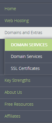
WebHostFace would have designed the hierarchy first, before they started coding their site. They would have made a diagram something like this:
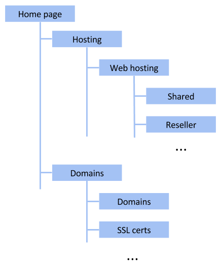
Each box is one page, or a category indicator (like the green things WebHostFace used).
They probably wrote a paragraph or two for each page, explaining what’s on it. For example:
Shared Hosting
Show summaries of three plans, with links to details of each one. Have a Signup button. Show any shared hosting sales.
Why make a page hierarchy?
Page hierarchies give you two Good Things.
Finding information
Sites with hierarchies make info easy to find. Want to find out about shared hosting? It’s obvious where to look.
Drawing a model helps you think about how information should be grouped. Do this before you start making pages.
Organize the project
Most IS projects need a team. Different people work on different parts of the system. When you put the parts together, they work as one IS.
Well, they should, anyway. The page hierarchy helps that happen. You assign different people to work on different parts of the hierarchy. Everyone knows what they should be doing, and what everyone else is doing.
Summary
Most Web sites are organized in a hierarchy. Drawing the hierarchy helps you decide what pages will be on the site. Sites with hierarchies make information easy to find. They also help you coordinate your project team.
Next
Let’s make a page hierarchy for Adopt-a-Dog.
