List of views
Let’s make a list of the views for the Gamerz IS, from the requirements.
- Members (public). Anyone can see it.
- People (manager). Only managers can see it. Lets them add, delete, change member data.
- Members with unpaid dues (manager).
- Projects (public).
- Projects (manager).
- Events (public).
- Events (manager).
For each one, we need to decide:
- Which nodes will be on the report (i.e., filters)
- What fields will be on the report
- How the fields will be displayed: table, list, grid…
Members
Members shows… well, the members of the org. We don’t have a Member content type, but we do have Person. What do we have to do?

- Name
- Phone (manager access only)
- Email (manager access only)
- Dues paid? (manager access only)
- Affiliation (member, etc.) (manager access only)
- Major(s)
- Project(s)
- Notes (manager access only)
Filter by affiliation, showing only members.
So far:
| View | Members |
| Access | Public |
| Content type | Person |
| Filter | Affiliation is Member |

Why? It helps managers do their work. For example, suppose Jimmy Carr hasn’t paid his dues. His Person node can be unpublished. It won’t show up on the members list. When he pays, the node is marked as published, and is back on the list.
| View | Members (public) |
| Access | Public |
| Content type | Person |
| Filter | Affiliation is Member Node is published |
Now, what fields should be on the view? The members list is available to anyone, so we only want to show public fields. That means:
- Name
- Major(s)
- Project(s)
| View | Members (public) |
| Access | Public |
| Content type | Person |
| Filter | Affiliation is Member Node is published |
| Fields | Name Major(s) Project(s) |
Let’s look at two options for display type. There are more, but let’s just look at the two most common: table, and unformatted list.
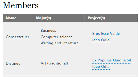
A table:

An unformatted list:

Tables look better and are easier for your eyes to scan. But notice that the table is wider than the unformatted list. Tables are often too wide for small phone screens, without horizontal scrolling. A table with a few fields fits OK on a phone. More than that, we might have a problem.
Does it matter whether the view fits on a phone? Depends. If the view is for org managers (or employees for a commercial project), maybe it’s OK that the view is best with a laptop. That’s not our situation, though. The view we’re working on is for potential members, who might well be using a phone. So, yes, for this view it matters.
Our table has three fields. Look at the member list on a phone, and you’ll see it looks OK. Let’s use a table for this view.
| View | Members (public) |
| Access | Public |
| Content type | Person |
| Filter | Affiliation is Member Node is published |
| Fields | Name Major(s) Project(s) |
| Display | Table |
On to the next view.
People
This one is for managers to work on people data.
| View | People |
| Access | Managers |
| Content type | Person |
What about filtering? There’s published, right?

| View | People |
| Access | Managers |
| Content type | Person |
| Filter | None |
What fields should be in the view? Managers see everything.
| View | People |
| Access | Managers |
| Content type | Person |
| Filter | None |
| Fields | Everything |
What about display? There are many fields, but table is OK, since it makes sense for managers to use bigger screens when on the site.
| View | People |
| Access | Managers |
| Content type | Person |
| Filter | None |
| Fields | Everything |
| Display | Table |
Members with unpaid dues
Like the last one, except…
| View | Unpaid dues |
| Access | Managers |
| Content type | Person |
| Filter | ??? |
| Fields | ??? |
| Display | Table |
We should only show nodes that have Paid dues? set to No. Anything else?


| View | Unpaid dues |
| Access | Managers |
| Content type | Person |
| Filter | Due paid? = No Affiliation = Member |
| Fields | Name Phone Published |
| Display | Table |
Projects (public)
In the last lesson, we chose these fields for project:
- Name
- Homepage (a URL)
- Description
All the fields are public.
| View | Projects (public) |
| Access | Public |
| Content type | Project |
| Filter | Published = Yes |
| Fields | Everything |
| Display | Unformatted list |
There are only a few fields, but they’re long. A table is too big for a phone. An unformatted list does the job. You can check out the view.
Projects (manager)

Events (public)
The fields from before:
- Title
- When
- Where
- Description
- Speakers
All the fields are public.
| View | Events (public) |
| Access | Public |
| Content type | Project |
| Filter | Published = Yes |
| Fields | Everything |
| Display | Unformatted list |
Events (managers)
Again, all the fields are public. We might not need a separate view for managers. More later.
Summary
The requirements listed a bunch of views for the Gamerz IS. We made a table like this for each one:
| View | Projects (public) |
| Access | Public |
| Content type | Project |
| Filter | Published = Yes |
| Fields | Everything |
| Display | Unformatted list |
