Sometimes you want a large image, say 500 pixels wide, to show on a small screen, like a phone.
How? Here’s one way.
Edit the page, and add the image as usual.
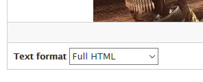
Switch to Full HTML editing mode.

Now switch to Source mode:

That will show you the HTML behind the page.
Find the code for the image. It will start with <img. For example:
<img alt="Far Cry 2" data-align="center" data-entity-type="file"
data-entity-uuid="0041fc33-91dc-4e72-b956-40fc65dc7c16"
src="/sites/default/files/inline-images/fc-2-1.jpg" />
Tip: The alt text will be whatever you typed in.
At the end of the tag, before the /, put this in:
style="max-width: 100%; height: auto;"So, the code above would become:
<img alt="Far Cry 2" data-align="center" data-entity-type="file"
data-entity-uuid="0041fc33-91dc-4e72-b956-40fc65dc7c16"
src="/sites/default/files/inline-images/fc-2-1.jpg"
style="max-width: 100%; height: auto;" />
(You can leave all of the code on the same line, if you want.).
Save the page.
Now, the image will shrink when viewed on a small screen.
Important! This will only work if you add the style attribute to all of the images you put on the page. So if I added three images, I would have to add the style attribute to all three.
