Let’s check in with the team.

Ruben
Hey, guys!
How should the Adopt-a-Dog site look?

Georgina
Friendly, happy. Like dogs.

Marcus
But not childish. You know, all bright colors and googly eyes.
Georgina
Hmm, I see what you mean.
OK, happy, friendly, but not childish.

Ruben
So how do you do that?

Ray
Photos will be important. Happy dogs, playing with people.
From a marketing point of view, photos of dogs with people are better than photos of dogs alone. Dogs-with-people show the benefits of having a dog.

Adela
The veterinary page might be different. Maybe a dog getting a checkup would be good there.
Georgina
Good point. The donation page could show a sad dog.
Sometimes sites have more than one look-and-feel, depending on what part of the site you visit.

Adela
OK, so happy dog photos, except on the veterinary and donation pages. That make sense to everyone?
Good teamwork. Summarize, and ask for closure.

Ray
Language should be relaxed, comfortable. OK?
(Nods all around.)

Marcus
How about the theme? I’m not artist.

Georgina
Me neither. When in doubt, use Bootstrap?

Adela
Sounds good to me.
The team installed Bootstrap from
https://www.drupal.org/project/bootstrap. They chose the United look, in the advanced settings.

Marcus
Wait a minute. We can’t use the logo that comes with Bootstrap.


Georgina
Oh, yeah. And we can’t use the shortcut icon, either. That’s the thing in the browser tab.
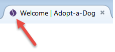
It’s also called a favicon.

Adela
Adopt-a-Dog doesn’t have a logo. Hmm…
Any ideas, Ruben?

Ruben
I had the same situation myself, a few years ago, with a site about dogs. I had to make a logo, too, and I
suck at art.
I found a drawing of a dog silhouette, Like one on Pixabay. It’s not the same one, but close.
I took just the head, and made it white, with a transparent background. Sized it, and it worked OK.
Not the best art, but it got the job done.
Here, I’ll email you the file.
(Typey typey, clicky, clicky.)

Georgina
Thanks! I’ll mess with it, to fit our site. Make a version for the shortcut icon, too.
Here’s the team’s look-and-feel model:
Descriptors
Happy, friendly, avoid childish
Exceptions
Veterinary page – dogs need healing
Donations – sad dogs
Implementation notes
Many photos, emphasize dogs with people
Bootstrap theme, unless we find an expert in Web look-and-feel.
Choose one of the variants that come with the theme.
Create logo and shortcut (favicon)
So, we have a page hierarchy, and look-and-feel decisions. Time to make the site.


![]()


